Copper Blessings | Catherine Pooler Designs “Autumn on Main”

There is just something about creating Fall cards that makes me happy—the warm colors, beautiful leaves, rich metallics and all those cozy Autumn details! Today I’m sharing a card featuring the brand new “Autumn on Main” Collection from Catherine Pooler Designs. This collection is packed with everything I love about the season: gorgeous leaves, harvest-inspired images, pumpkins and gourds, bold patterned papers and some really fabulous new dies!

For my card, I reached for the beautiful “Fall Flourishes” Stamp and Die Set. This set includes five wonderful Fall images—a maple leaf, an oak leaf, a stem of wheat, an acorn and a chestnut—and I couldn’t resist using every single one!

I stamped all of the images and colored them with my Copic Markers, building up lots of layers of color to give them plenty of dimension. I especially love how the greens, yellows, oranges and reds blend together on those beautiful Fall leaves. They really became the stars of the card!

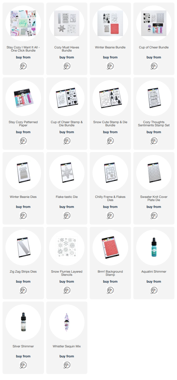
For the background, I began by die cutting a piece of kraft cardstock with the “Tuffed Cover Plate Die”. I love the subtle stitched texture this adds without competing with all of those colorful images.

Next, I used the “Around the Loop Nested Dies” to create a modified oval opening in the center of the panel. Before popping the panel up onto my white card base, I blended a little Spiced Ink along the inside edge of the oval. That touch of warm color helps define the opening and adds even more depth to the design.

Once the background was in place, I arranged all five of my Fall Flourishes images around the oval, overlapping and layering them to create a full harvest-inspired cluster. The wheat tucked behind those colorful leaves adds such a pretty bit of texture!

Of course, this card needed a little sparkle, so I pulled out the new Copper Shimmer and added splatters across the kraft background and some of the Fall images. The warm copper shine is absolutely perfect with an Autumn color palette.

For the finishing touch, I used the “Harvest Duo Word Dies” to create the large “Blessings” sentiment. I die cut the word from beautiful copper metallic cardstock and paired it with the coordinating white cardstock shadow layer. I love how that shiny sentiment stretches right across the center of the card and ties in perfectly with the Copper Shimmer splatters.

I absolutely love how this card turned out! It has all those rich, warm and colorful elements that make Fall crafting so much fun.

The new “Autumn on Main” Collection will be available in the Catherine Pooler Designs shop on Wednesday, but StampNation members get to shop early on Tuesday!

You can shop Catherine Pooler Designs here: https://shop.catherinepooler.com?aff=49

Happy Fall crafting, everyone! 🍁🌾🧡

~ Ally ~ 

Back to COOL with Sweet November Stamps

It’s time to head back to school, and the new First Day digital stamp collection from Sweet November Stamps is filled with adorable images for creating cheerful classroom scenes! The collection includes a variety of sweet students, a teacher, a crossing guard and plenty of school-themed accessories, including desks and lockers.

For my card, I combined Eliza, Kenny, Lainey, Tanner and Mrs. James with the Teacher’s Desk images to create a busy first-day classroom scene. One of my favourite things about working with digital stamps is being able to resize, arrange and layer the images until the scene looks exactly the way I imagined.

Once everything was printed, I coloured the entire scene with a rainbow of Copic Markers. I had so much fun choosing different colours for each child’s clothing, backpack and shoes. All those bright details give every student their own personality and capture the excitement of arriving at school for a brand-new year.

I kept the classroom background simple so the colourful characters would remain the focus, adding a soft green chalkboard wall, a neutral floor and a few subtle shadows beneath everyone’s feet. The playful “Back to COOL!” greeting was the perfect finishing touch for this happy school scene.

The new First Day collection offers so many possibilities for back-to-school cards, teacher appreciation projects, lunchbox notes and scrapbook pages. I can’t wait to create even more school adventures with these adorable characters!

Happy Saturday all!

~ Ally ~ 

Merry and Bright in Non-Traditional Holiday Colors

Today I’m sharing another festive card featuring products from the Catherine Pooler Designs and Sizzix collaboration. For this design, I stepped away from traditional holiday reds and greens and created a soft, modern woodland scene using warm peach and vibrant pink tones.

I began by securing the Star on Top layered stencils in the Print & Pattern Tool. For the first stencil layer, I softly blended Clay Mask ink over the trees and added a light layer of Pucker Up ink toward the treetops. I repeated the same color combination with the second stencil layer, using a heavier hand to deepen the shades and bring definition to the overlapping trees.


To coordinate the greeting with the background, I created a separate ink-blended swatch using the same Clay Mask and Pucker Up combination. I then die cut the large “Merry” greeting using the new Oh So Merry Dies. I love how the blended cardstock carries the color palette into the sentiment while the playful lettering adds a bold focal point.

To complete the greeting, I stamped “and bright” from the Warm Winter Wishes Sentiments stamp set and added it on a slim banner beside the die-cut word. A splattering of Pearl Shimmer across the background added the perfect finishing touch of snowy sparkle.


I absolutely love the cheerful, non-traditional colors on this holiday card. The combination of peach, pink and shimmer gives the winter trees such a warm and whimsical feel!

You can find these products in the Catherine Pooler shop!

~ Ally ~ 

Warm Winter Wishes with CP & Sizzix

Today I’m sharing a cool and cozy winter card featuring the “Around the Holiday” stamp set from the Catherine Pooler Designs and Sizzix collaboration. This playful set includes a variety of graphic holiday images that work together beautifully to create a bold, repeating pattern.

I used the Print & Pattern Tool to line up and stamp the images across a piece of white cardstock. The tool made it easy to build the pattern evenly while alternating the different squares. For a soft tone-on-tone winter palette, I stamped the images using Glacier and Stone Blue inks. I love how the two shades add subtle variation while keeping the background cohesive and frosty.

Once the patterned panel was complete, I layered it onto a narrow piece of dark navy cardstock and adhered it to a Stone Blue cardstock card base. The simple layers help frame the stamped design and add a little extra contrast.

For the greeting, I selected the beautiful “Warm Winter Wishes” sentiment from the “Warm Winter Wishes Sentiments” stamp set. I stamped it in dark blue ink, die cut it into a circle and popped it up over the bottom corner of the patterned panel.


This card was so much fun to create, and the Print & Pattern Tool made building the repeating design quick and easy. The “Around the Holiday” stamp set is perfect for creating winter cards, holiday backgrounds, tags and so much more!

The new CP and Sizzix products are available now in the CP Shop!

~ Ally ~ 


09 10