Showing posts with label water colour. Show all posts

Harvest Hugs | Catherine Pooler Designs “Autumn on Main”

Today I’m sharing another card featuring the beautiful new “Autumn on Main” Collection from Catherine Pooler Designs! For this card, I wanted to play with some unexpected Autumn colors and pair those fresh aquas and greens with the gorgeous warmth of the new Copper Shimmer. I love how striking these colors look together!

I started by creating my own fun marbled, watercolor effect background paper using Melon Ice, Aquatini and Uptown inks. I dabbed and layered the inks to build up lots of variation and texture, allowing the colors to blend and mingle together. Once I was happy with my background, I added a splattering of the new Copper Shimmer for a little sparkle and warmth. Those tiny copper flecks look so pretty against all of that turquoise and green!

Next, I took a piece of Catherine Pooler’s Favorite White Cardstock and painted it completely with Copper Shimmer. Once it was dry, I die cut the beautiful new “Willow Silhouette” Die from my handmade metallic cardstock. I absolutely love how this turned out! Painting the cardstock first gave me a gorgeous custom copper paper with lots of beautiful shine and texture.

For the greeting, I reached for the new “Harvest Duo Word Dies.” I die cut the delicate scripted “harvest” word and colored it with Uptown Ink, then layered it over the coordinating white shadow die cut. That deep teal really helps the sentiment stand out against the colorful background.


I wanted to turn my greeting into “harvest hugs,” so I did a little selective stamping with one of the sentiments from the “Autumn Greetings” Stamp Set. I stamped just the word “hugs” in Uptown Ink and cut it out with its coordinating die. I love being able to stretch my sentiment stamps by using just a portion of a greeting!

To finish the card, I layered my marbled panel onto a little peek of Uptown-colored cardstock before adding it to my white card base. The combination of those cool jewel-toned colors, the crisp white and all that beautiful copper shine makes this such a fun take on an Autumn card.

StampNation members can shop the new Autumn on Main Collection today! Everyone else can join in tomorrow when the entire collection goes live in the Catherine Pooler Designs shop at 9am ET.

You can shop Catherine Pooler Designs here:
https://shop.catherinepooler.com?aff=49

Happy crafting! 🍂🩵✨

~ Ally ~ 
A Rich and Layered Holiday Wreath

Hello, crafty friends! Today I’m sharing another festive card created with the new Catherine Pooler Designs and Sizzix collaboration. For this project, I used the gorgeous Holiday A-door-nment Die Set, a delightful collection featuring a large wreath base, extra leaves, berries, a layered bow and playful star accents. It is perfect for creating cozy Christmas cards, gift tags and beautiful seasonal décor.

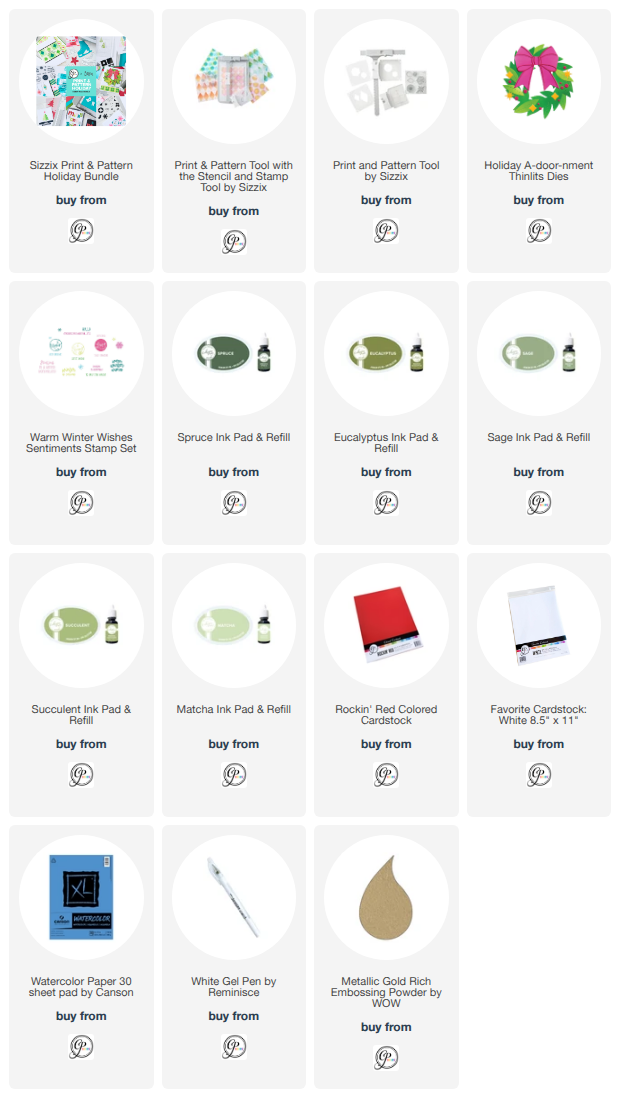
To create the wreath, I first made my own watercolor-inspired paper using Sage, Eucalyptus, Spruce, Matcha and Succulent inks. Once the paper was dry, I die-cut the main wreath and several additional leaves, giving me a lovely assortment of greens with natural variations in color and texture. I layered the extra leaves around the wreath to make it feel especially full and dimensional, then added small white splatters for a snowy finishing touch.

For a bright pop of traditional holiday color, I die-cut the berries from Rockin’ Red cardstock and scattered them throughout the greenery. The large layered bow became the star of the design, with its bold red pieces and elegant gold cardstock accents. I love how the metallic details define each section of the bow and add a touch of holiday shine.


The greeting comes from the new Warm Winter Wishes Sentiments Stamp Set. I chose the ornate circular “Merry” sentiment and heat embossed it in gold, then tucked it behind the bow so it appears to be hanging in the centre of the wreath. The gold embossing coordinates beautifully with the bow accents and the thin metallic layer framing the card panel.

I absolutely love how rich and layered this card turned out! The mix of watercolor textures, dimensional greenery, vibrant red details and touches of gold gives this classic Christmas wreath a warm and elegant feel.

~ Ally ~ 

Sweet Summer Treats & Boardwalk Blues

Hello crafty friends!

The Better With Sprinkles Release is officially available in the Catherine Pooler shop, and today I'm sharing a sweet and simple card featuring several of the fun new products from this collection!

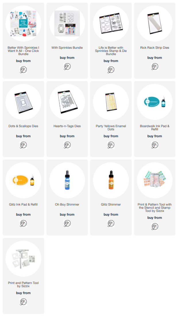
I started by creating the focal panel using the adorable popsicle images and sentiment from the Life Is Better With Sprinkles stamp set. To create the repeating pattern, I used the new Print & Pattern Tool collaboration from Catherine Pooler and Sizzix. This tool makes it so easy to create perfectly aligned backgrounds and custom patterned panels!


The images were stamped onto watercolor paper using the brand-new Boardwalk ink, a gorgeous medium blue from the Party Collection. Once everything was stamped, I lightly spritzed the panel with water and let the ink soften and move across the paper for a fun watercolor effect. After it dried, I added splatters of Glitz Ink and the new Oh Boy! Shimmer for a little extra sparkle and shine.


For the background, I blended Glitz Ink onto white cardstock to create a bright yellow ombré effect before die cutting it with the Rick Rack Strip Dies. The playful waves add so much movement and perfectly complement the sweet summer theme. I attached the strips to a panel created with the Dots & Scallops Die, then layered my watercolor panel across the center.

To finish the card, I added a simple banner detail and a few Party Yellows Enamel Dots for pops of coordinating color.

I love how the bright yellow and Boardwalk blue come together for a cheerful summertime feel! The entire Better With Sprinkles Release, including the beautiful new Boardwalk ink, is available tomorrow in the Catherine Pooler shop.

Happy crafting! 💙💛🍦

~ Ally ~ 

Sweet November Stamps ~ Topaz Dragon

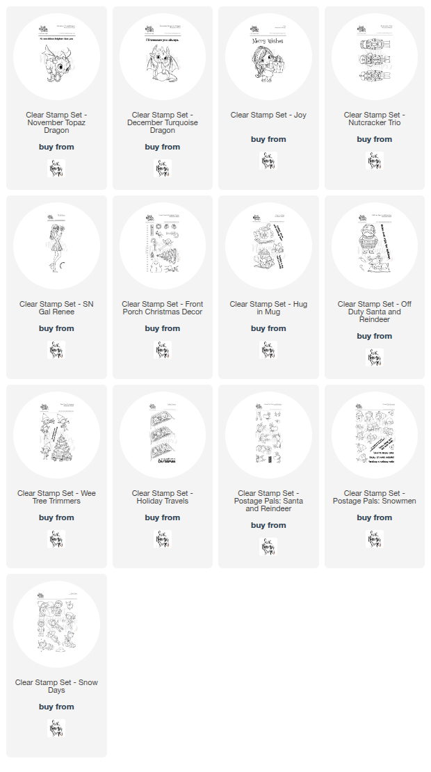
Hello friends! 💙 Today I’m excited to share a magical card featuring the November Topaz Dragon from Sweet November Stamps. This sweet little dragon is part of the birthstone dragon series, and I couldn’t resist bringing him to life with watercolor for something a little different than my usual coloring style.


I stamped the November Topaz Dragon and colored him using watercolors, allowing soft blends and subtle textures to really shine. The loose, dreamy look of watercolor felt like the perfect match for this whimsical dragon and his glowing topaz gem. I especially love how the lighter washes give him an almost storybook feel.

To frame the dragon, I created a circular night-sky backdrop using deep blue marbled patterned paper, adding gold splatter and gold sparkle gelly dots for a bit of sparkle and magic. Soft clouds drift across the scene, giving him a cozy place to perch while protecting his precious gem. I paired everything with pale blue striped paper to keep the design light and airy without taking away from the focal image.


The sentiment, “No one shines brighter than you,” felt like a perfect fit for this birthstone-themed card and makes it great for birthdays, encouragement, or just-because happy mail.

This card was such a fun reminder of how versatile Sweet November Stamps images are—whether you love Copics, watercolor, or colored pencils, they truly shine in any medium.

Thanks so much for stopping by today! I hope this inspires you to pull out your watercolors and give one of these adorable dragons a try. 🐉✨

~ Ally ~ 

Crafty Meraki ~ Just a Note

Hello, crafty friends!

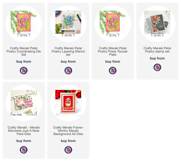
Today I’m thrilled to share a sweet and simple card that’s close to my heart, created with the brand new Petal Poetry stamp and stencil combo from the Meraki Harmony release by Crafty Meraki.

I absolutely adore how soft and elegant this set is — those florals are timeless and just perfect for building a heartfelt card like this one. Whether you’re sending a little love or a thoughtful “thinking of you” message, this set has you covered.


For this card, I started with the Petal Poetry coordinating stencil, blending the layers with my favorite Catherine Pooler inks to bring the blooms to life. The ink shades layer beautifully, adding depth and dimension with hardly any effort. I went for a delicate pink-and-green combo to keep things fresh and floral.

Once the flowers and leaves were stencilled, I used the coordinating Petal Poetry stamp set to add that perfect crisp detail, then I die cut all the elements to arrange around my card front. A soft watercolor-inspired background in pink tones adds a dreamy touch and lets the floral cluster shine.

To finish it off, I added a bold, foiled sentiment: “Just A Note”, framed with a sleek gold foiled border to ground the design. A few inky splatters around the card add a bit of dramtic elegance, without overpowering the soft floral vibe.

I hope this card inspires you to give the Petal Poetry collection a try — it's such a versatile set for so many occasions! Whether you’re new to layering stencils or a seasoned stamper, this combo will quickly become a favorite in your crafty stash.

Stay creative and keep sharing those beautiful handmade moments!

With inky fingers,

~ Ally ~

Crafty Meraki ~ Magnolia Hugs

Crafty Meraki is celebrating a new Spring release.  Introducing the Meraki Harmony collection!

For today's card I used the new "Whimsical Magnolias" stamp set.  

I started by stamping the magnolia images with Distress Vintage Photo ink. and coloring them in using ZIG Clean Color Markers.


Once they were all colored, I die them all out using the coordinating "Whimsical Magnolias Dies".

I added them to my natural cardstock panel that I had splattered with gold metallic paint.

I paired them with a strip of kraft cardstock featuring the "Sahara Symphony Die" - which I love!


The final piece was to add a sentiment.  I chose the gold foiled "Hugs" greeting from the "Gilded Greetings ESP" paper.

I just love the final look of this card!  Have a great week everyone!

~ Ally ~
Sweet November Stamps ~ Happy Fall Y'all

Happy Wednesday!  Today's card features the suave new "SN Gal Olive" stamp set from the latest clear Fall stamp release from Sweet November Stamps.

Today's card was made for a Craft Roulette episode a few weeks back.   It got sent to my StampNation PenPal for October hence why I'm late posting this.  I didn't want to spoil the surprise!

The parameters were as follows:

The four parameters that the wheel gave us for Episode #237 were:

  • Project: Pop Up Card (my gal is mounted on some according pieces of paper and springs up)
  • Colors: Trick-or-treat Colors (I went with pinks, browns and oranges)
  • Element: Boutique (she appears like someone who might have just shopped in a boutique - her trendy purse!)
  • Random: Jewelry (she's wearing a necklace)

Here's a little close up...

The images I used for my card include "SN Gal Olive" and the new "Background Builder: City Sidewalks" clear stamp sets.

This was so fun to create!

I hope you check out Craft Roulette!  We watch and play every Friday.  Join us over on the YouTube channel at 6:10pm CST.  You can play along with us too and submit a card using that week's parameters on your project.  PLUS you have a chance to win some amazing prizes for our Spin Sponsors for participating!

See you there!

~ Ally ~

Scrap 'N Stamp ~ Pooh & Friends Inspirational Hop **PRIZE**

Welcome to the Scrap 'N Stamp Pooh & Friends Inspirational Blog Hop!

Today's hop is all about the adorable Winnie the Pooh and friends!

My card features the adorable "Piglet Eeyore Tree" stamp set from Impression Obsession!

I began today's card by stamping the sweet image on some water color cardstock using my Distress Vintage Photo ink.  Yup... regular water based Distress ink!


I then proceeded to watercolor this image with Catherine Pooler inks: Do-si-do, Sage, Stone Blue and Catching Rays.  The cool thing about stamping an image with water based inks is that is blends into your paint with has a cool effect on your images.  I then fussy cut out the image.

Next I cut the orange with red chevron patterned paper from the "Winnie the Pooh" 6x6 patterned paper pack for my card base.  I also used my Tonic Deckle Edge Trimmer to cut a piece of blue tone-on-tone patterned paper from the same paper pack.  I added some machine stitching before adhering it to the card.

To finish off the card, I tied some twine around the end of the card base, added a stamped sentiment from the "Piglet Eeyore Tree" stamp set and for that final touch, I added some Craft Consortium "Adhesive Pearl Stars".

It turned out super cute!

Make sure you check out all the amazing sales...  CLICK THE IMAGE BELOW!

NOW... check out all the other projects that our design team has to share!!

Here's our hop list...

Scrap'n Stamp
Meghan
Allison
Deepa < go here!
Tara

Tracey
Kia

 
Now for the GIVEAWAY...

 GIVEAWAY DETAILS!!


  1.  Hop along and LEAVE A COMMENT on each designers blog post.
  2.  One lucky WINNER will be chosen to receive a $50 gift certificate to the store.
  3.  Winners will posted on the Scrap 'N Stamp blog sometime in mid to late November.  Good luck!

Thanks for stopping by!  Happy hopping and GOOD LUCK!

~ Ally ~ 

Scrap 'N Stamp ~ Mixed Media & Lavinia

Join me today at 2pm EST for a LIVE tutorial on how to create a mixed media panel featuring Lavinia products.

The card above features the Lavinia "Shadow Bloom" and "Moss Flowers" stamp sets plus all kinds of other mediums.

I'll be over on the Scrap 'N Stamp Facebook group! 

Hope to see you there!

~ Ally ~

Catherine Pooler Designs ~ Watercolored Bloom

Happy Monday everyone!  We have a brand new Catherine Pooler Designs holiday collection coming to the shop TODAY!  This collection is called Holiday Magic and goes live in the shop at 9 am EST.

Today I'll be sharing projects featuring products from the "Greenery of the Season Bundle"... again!

We're going to start with the stunning "Holiday Spice" patterned paper pack. I pulled this amazing and festive piece of plaid from the pack of amazing patterns to use.  Each pack of CP patterned papers, listed the corresponding ink colors included in that pack of paper - so brilliant for matching ink colors to your projects!

I started by die cutting a piece of white cardstock with the "Petal Connection Cover Plate Die" and applying it to the card base.

Next I cut a wide strip of the plaid paper and using my sewing machine to sew 2 wonky lines across the top and bottom of the patterned paper.  Next I added a bit of water to the sewn edges of the paper and distressed them a bit.  I adhered this paper over the die cut card base.

Next I took out some watercolor paper and stamped my greenery elements from the "Greenery of the Season" stamp set in Icing on the Cake ink.  I then watercolored each element using more CP inks: Wintergreen, Eucalyptus, Samba, and Buttercream.

For the pine boughs, I stamped them in Wintergreen ink and then brushed their needles with water to soften the image.

I just how these pieces of greenery came out - soft and painterly.

Make sure you join Catherine and Erika for all the live action!

You can check out these lovely ladies over on the Catherine Pooler Designs Facebook page or on their YouTube channel.

In honor of the anniversary of September 11th, this collection will go on sale TODAY - TUESDAY SEPTEMBER 10th instead of the normal Wednesday reveal.  The full Holiday Magic collection will go live in the CP Shop at 9am EST.

You're going to love all this holiday goodness!  More card creations coming tomorrow!

Happy shopping!

~ Ally ~ 

Catherine Pooler ~ Vintage Holiday Wishes

Happy Monday everyone!  We have a brand new Catherine Pooler Designs holiday collection coming to the shop!  This collection is called Holiday Magic and has two main bundles plus a whole lot more!

Today I'll be sharing projects featuring products from the "Greenery of the Season Bundle"... again!

We're going to start with the stunning "Greenery of the Season" stamp set.  I wanted to create a soft, rustic feel so I kept my coloring subtle and added some distressed touches.

I first chose my paper.  I found a creamy white cardstock with a natural fibre and speckle in it.  I also found a medium toned kraft cardstock too.

I started by die cutting the kraft cardstock with the "Scallops & Dots Dies" die.  Then I took some Versamark ink and stamped some inner orange slices stamp from the "Greenery of the Season" stamp set.  It's a subtle tone-on-tone effect of the orange slice detail.

Next I took a piece of water color paper and stamped all of my greenery.  I used some Icing on the Cake ink to stamp all of those out.  Next I used the following ink colors and water colored in each element: Seafoam, Eucalyptus, Rouge, Tiki Torch, Tiara, Buttercream and Samba.

I die cut out all of my greenery pieces using their coordinating dies, "Greenery of the Season Dies".

I die out an oval shape using the "Around the Loop Nested Dies" from the natural creamy cardstock, stamped on a greeting using Icing on the Cake ink and added a soft Sand Castle kiss of ink on the oval too.

I used a little dab of Icing on the Cake ink and some water and dyed my cheesecloth for a touch of texture to add.

I just adore this card!  I think it's my favorite of all my makes for this collection.

Mare sure you join Catherine and Erika for all the live action!

You can check out these lovely ladies over on the Catherine Pooler Designs Facebook page or on their YouTube channel.

In honor of the anniversary of September 11th, this collection will go sale on TUESDAY SEPTEMBER 10th instead of the normal Wednesday reveal.

If you are a member of StampNation, you will be able to purchase your Holiday Magic goodies EARLY.  Sign into the CP Shop using the same email you use for StampNation and the products will be in the shop at 12 noon EST TODAY.

You're going to love all this holiday goodness!  More card creations coming tomorrow!

Happy shopping!

~ Ally ~
Scrap 'N Stamp ~ Manly Masterpieces Hop *PRIZE*

Welcome to the Scrap 'N Stamp Manly Masterpieces Blog Hop!

Today's card features the very dapper Lavinia "Small Compass" stamp set!  My husband is a sailor and so I'm always attracted to things that are sailing related.  Of course, a compass is used in other ways like orienteering (ask me how I know... Scout Leader here!) 

So I started out my card by created a background.  For my background, I stamped the compass image in random spots all over the watercolor paper.  Then I applied some light washes of several Catherine Pooler Designs inks including, Tranquil, Cove Blue and Mardi Gras.


I also used the All & Create "Cascading Dots #173" stencil to add some random dots on my grungy background.


For the finishing touches, I used the Happy Birthday die from one of my favorite stamp & dies sets, the Hero Arts "Stamp & Cut XL - Birthday" set using some Prism Studio "Solar White" and "Iris" cardstock.  I adhered them both together with a slight offset so the white sentiment would break up the sentiment from the card base.

Lastly, I added a heat embossed compass image on a piece of vellum just below the sentiment.  It's a little more texture to the card with the vellum and the raised embossed image.

We also have some shop SALES to go along with our fun theme. Check out the SALES for this event!


This is our hop rotation this month...

Scrap'n Stamp Blog
Meghan
Kate
Allison
Deepa <== GO HERE!
Tara
Tracey

Now for the GIVEAWAY details...

 GIVEAWAY DETAILS!!

  1.  Hop along and LEAVE A COMMENT on each designers blog post.
  2. One WINNER will be chosen to receive a $50 gift certificate to the store.
  3.  Winners will posted on the Scrap 'N Stamp blog on June 18th.  Good luck!

Thanks for stopping by!  Happy hopping and GOOD LUCK!

~ Ally ~ 
 
09 10