Showing posts with label birthday. Show all posts

Sweet Summer Treats & Boardwalk Blues

Hello crafty friends!

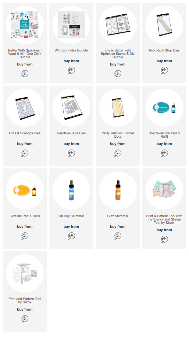
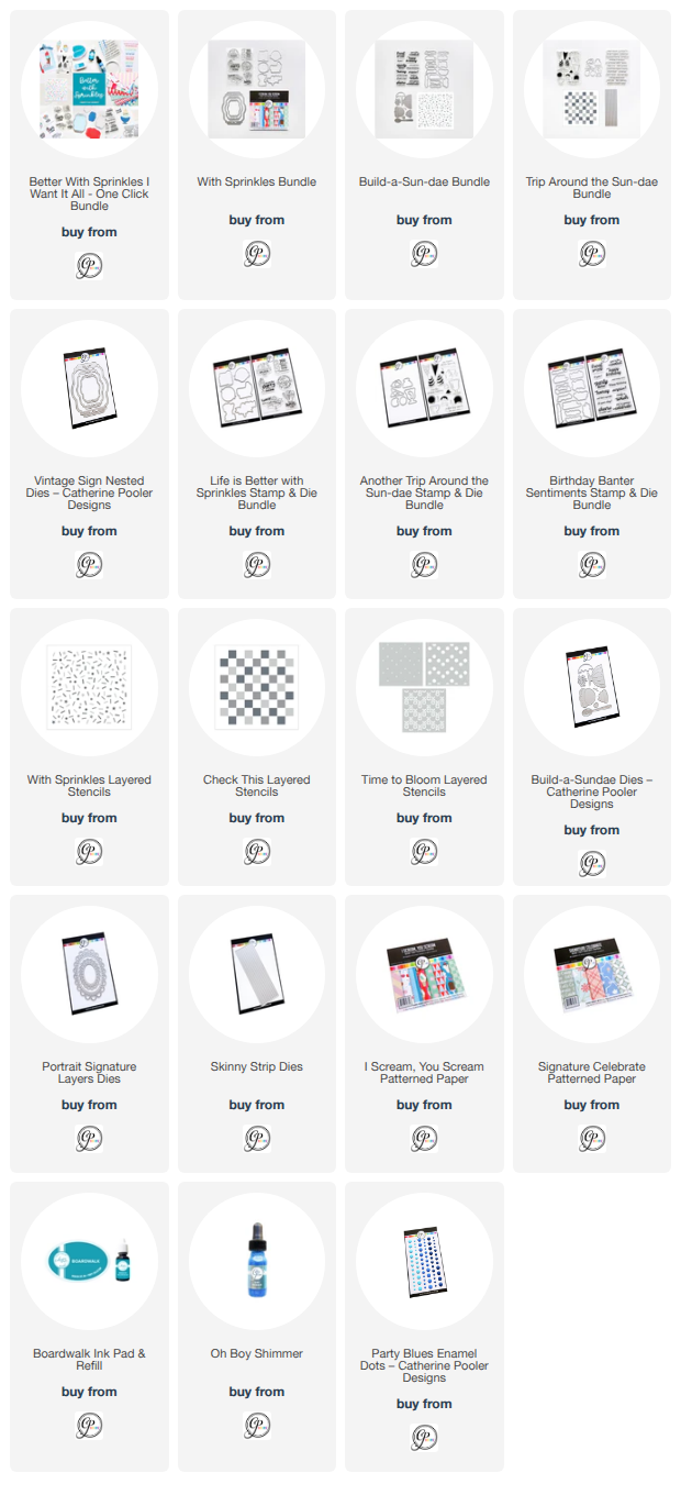
The Better With Sprinkles Release is officially available in the Catherine Pooler shop, and today I'm sharing a sweet and simple card featuring several of the fun new products from this collection!

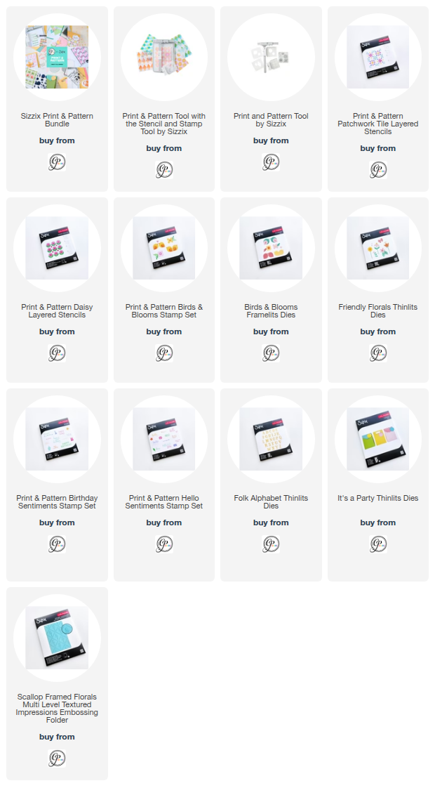
I started by creating the focal panel using the adorable popsicle images and sentiment from the Life Is Better With Sprinkles stamp set. To create the repeating pattern, I used the new Print & Pattern Tool collaboration from Catherine Pooler and Sizzix. This tool makes it so easy to create perfectly aligned backgrounds and custom patterned panels!


The images were stamped onto watercolor paper using the brand-new Boardwalk ink, a gorgeous medium blue from the Party Collection. Once everything was stamped, I lightly spritzed the panel with water and let the ink soften and move across the paper for a fun watercolor effect. After it dried, I added splatters of Glitz Ink and the new Oh Boy! Shimmer for a little extra sparkle and shine.


For the background, I blended Glitz Ink onto white cardstock to create a bright yellow ombré effect before die cutting it with the Rick Rack Strip Dies. The playful waves add so much movement and perfectly complement the sweet summer theme. I attached the strips to a panel created with the Dots & Scallops Die, then layered my watercolor panel across the center.

To finish the card, I added a simple banner detail and a few Party Yellows Enamel Dots for pops of coordinating color.

I love how the bright yellow and Boardwalk blue come together for a cheerful summertime feel! The entire Better With Sprinkles Release, including the beautiful new Boardwalk ink, is available tomorrow in the Catherine Pooler shop.

Happy crafting! 💙💛🍦

~ Ally ~ 

Life Is Better With Sprinkles!


Summer crafting just got a whole lot sweeter with the brand-new Better With Sprinkles release from Catherine Pooler Designs! Today I'm sharing a simple and fun card that lets one of my favorite new products take center stage—the adorable I Scream, You Scream Patterned Paper Pack.

The moment I saw this paper filled with colorful ice cream cones, popsicles, and cherries, I knew it deserved to be the star of the show. The "Boardwalk" colored background paired with all those sweet treats instantly creates a cheerful summertime vibe without needing a lot of extra embellishments.


To keep the design clean and playful, I paired the patterned paper with the new Life is Better With Sprinkles Stamp & Die Set. The darling ice cream sentiment perfectly complements the paper and adds a fun focal point to the card. I stamped and die cut the sentiment, then layered it onto one of the gorgeous shapes from the new Vintage Sign Dies. The soft mint plaid background on the sign adds just the right amount of detail while helping the sentiment stand out.

A simple pull-tab style element tucked behind the sentiment adds a little extra interest while keeping the overall design quick and easy to recreate. Sometimes patterned paper does all the heavy lifting, and this card is proof that a few well-chosen elements can come together for a sweet summertime project in no time!

StampNation members already have access to shop the Better With Sprinkles release, and the full collection will be available to everyone tomorrow.

Thanks so much for stopping by today, and I hope this card inspires you to create something sweet!

Happy crafting! 🍦🍒🍭

~ Ally ~ 

Hooray for Summer Treats! ☀️🍧


Today I'm sharing a bright and cheerful card featuring products from the brand new Better With Sprinkles release from Catherine Pooler Designs! This fun-filled collection is packed with sweet summer treats, playful sentiments, and fresh new colors that are perfect for all your summertime crafting.

For this card, I wanted the background to be the star of the show. I created a soft, wavy design using the gorgeous new Party Collection ink color, Boardwalk. By blending the ink in varying intensities, I was able to create layers of cool blue waves that remind me of a sunny day by the water.


To add a little extra sparkle and shine, I splattered the entire panel with the new Oh Boy! Shimmer. The subtle shimmer catches the light beautifully and adds just the right amount of summer magic.


I kept the focal point simple with one of the adorable images and sentiments from the new Life Is Better With Sprinkles stamp and coordinating die set. This sweet set includes six fun summer dessert-themed greetings along with coordinating images that are perfect for birthdays, celebrations, and sending a little sunshine to someone special. I love how this tiny popsicle and sentiment pop against the bold blue background!

Sometimes all you need is a simple design, a fresh color palette, and a touch of sparkle to create a card that's ready to celebrate.

Release Information:

  • StampNation Members: Shop early on Tuesday, June 16
  • Public Release: Available Wednesday, June 17

Thanks so much for stopping by today! I hope this card inspires you to play with layered ink blending and add a little shimmer to your next project.

Happy crafting! 💙🍧✨

~ Ally ~ 

Lighting Up the Night with Summer Celebrations

Hello crafty friends!

Today I’m sharing a card featuring some of the adorable images from the new Sweet November Stamps Summer Celebrations digital release! This cheerful scene combines elements from several sets to create a magical summer evening filled with friendship, fireworks, and fun memories.

For my focal point, I used the sweet kiddos and colorful fireworks from the Light Show collection. I just love the perspective of these two friends sitting together and watching the fireworks dance across the night sky. To give them the perfect place to enjoy the show, I added the picnic table from the Popsicles collection.

I colored everything with Copic Markers, building a deep twilight sky that allows all of those bright fireworks to really shine. The vibrant reds, yellows, greens, blues, and purples create a spectacular display against the dark background, while the warm tones on the children help draw the eye to the focal point of the scene.

To finish the card, I added the sentiment "You Brighten My Day!" on a simple banner die cut. It felt like the perfect greeting to complement the joyful fireworks and the heartwarming friendship captured in the image.

I love how this card celebrates those special summer moments—sitting outside with friends, watching fireworks light up the sky, and making memories that last long after the show is over.

Thanks so much for stopping by today! Be sure to check out the entire Summer Celebrations release from Sweet November Stamps for even more adorable images perfect for all your summertime crafting.

Happy coloring! ✨🎆🎇

~ Ally ~ 

Drift, Dance, Dream with Laguna

Hello friends! Happy Wednesday!

Today I’m sharing a bright and cheerful beach scene featuring the adorable Laguna little mermaid from Sweet November Stamps. With her sweet smile, curly hair, and vibrant pink tail, she was the perfect focal point for a sunny seaside card!

To create the scene, I paired Laguna with the large island image from the Dock on the Bay Scene Builder stamp set. The tropical shoreline instantly set the stage for a relaxing day by the water. I colored the entire scene with Copic Markers, blending soft aqua waters, sandy beaches, and lush island greenery to bring the coastal setting to life.

For Laguna herself, I chose bright pinks for her tail and added a fun pop of orange to her bow. The contrast against the cool blues of the water helps her stand out beautifully against the background. I also added lots of shading and highlights to give the scene depth while keeping the overall look bright and playful.

The sentiment comes from the new Merwee Tide Dancers stamp set and perfectly captures the carefree summer vibe of the card: "Drift, Dance, Dream." I stamped it in black to anchor the design and balance the bright colors throughout the scene.


To finish the card, I mounted the completed panel onto some fun Catherine Pooler polka dot patterned paper. The colorful dots add an extra touch of whimsy and frame the beach scene without distracting from the focal image.

This card has me dreaming of warm sunshine, sandy beaches, and ocean breezes. Thanks so much for stopping by today, and I hope Laguna inspires you to create your own little seaside escape!

Happy crafting! 💕

~ Ally ~ 

Shell-ebrating Simple Summer Cards!

There’s something so relaxing about creating beach inspired cards and the new Catherine Pooler DesignsOcean Wonders” collection makes it so easy! Today’s card is all about keeping things simple while letting those beautiful seaside images shine.

For this clean and simple design, I used the adorable Beach Comber stamps and dies to create a soft monochromatic collection of seashells and starfish across the card front. I stamped all of the images using a blend of Creamsicle, Getaway, and Bellini inks for that warm sun-kissed coastal palette.

To keep the look cohesive, I used Creamsicle cardstock for the card base, which really helps all of the soft peachy tones blend together beautifully. The white die cut borders around each shell help the images pop while still maintaining that light and airy feel.


To finish the card, I added a sweet sentiment from the Beautiful Seas Sentiments stamp and die set:
“it’s time to shell-ebrate your day”

Sometimes simple cards are the most effective, and this one came together so quickly while still feeling bright, cheerful, and full of summer vibes!

Thanks so much for stopping by today!

~ Ally ~ 

Tidewater Tails – Luchia by the Shore 🌊

The newest digital release from Sweet November Stamps is here, and it’s absolutely fin-tastic! The “Tidewater Tails” collection is now available and features five gorgeous mermaids: Flavia, Luchia, Lunaria, Ondina, and Pacifica. Today, I’m sharing a card featuring the sweet and whimsical Tidewater Tail: Luchia.

I created a bright tropical scene for Luchia to perch in by pairing her with island elements from the Pirate Background Builder Set along with a few rocky accents from the Mermaid Rocks images. I love how these pieces come together to build a fun little island escape!

All of the images were colored with vibrant Copic Markers, really bringing this seaside scene to life. Those bold tropical tones and shimmering water make this card feel like a mini vacation!

Once my coloring was complete, I die cut the panel using a deckled edge die to give it that soft, organic finish. I layered it onto a handmade postage-style panel—because let’s be honest, the postage trend is just too fun not to play with! For a bit of extra detail, I stamped the background with the mermaid-themed postmarks from the Fantasy Post Marks stamp set.


To finish it all off, I added a sentiment from the Mermees Set#2 stamp set that perfectly matches the peaceful ocean vibe—“May waves of happiness wash over you.”

Thanks so much for stopping by today! Be sure to check out the full Tidewater Tails release—these mermaids are sure to make a splash in your next project!

~ Ally ~ 

Bright, Bold & So Easy with the Print & Pattern Tool!


I am absolutely loving the new Sizzix & Catherine Pooler collaboration—especially the amazing Print & Pattern Tool! If you enjoy creating clean, repeat designs with ease, this tool is going to be your new best friend.

For today’s card, I wanted something cheerful and full of color, so I reached for the gorgeous Print & Pattern: Daisy Stencil to create my main panel. The tool makes lining everything up effortless, giving you that perfectly spaced, professional-looking pattern in no time at all.


I went with a bright and playful color palette using Aquatini, Garden Party, Pucker Up, and Glam inks. These colors work so beautifully together—fresh, vibrant, and perfect for a celebratory card!

Once my background was complete, I die cut the panel using the classic Scallops & Dots Dies to add that subtle decorative edge. I mounted it onto a coordinating card base of Glam Cardstock to really let those colors pop.


To finish things off, I added a sweet sentiment and adorable cupcake icon from the Print & Pattern: Birthday Sentiments stamp set. It ties everything together perfectly and keeps the design fun and festive.

What I love most about this card is how quick and simple it was to create, while still looking detailed and polished. The Print & Pattern Tool really takes the guesswork out of repeat stamping and stenciling—and I can already tell I’ll be reaching for it again and again!

Have a great week!

~ Ally ~ 

Happy Birthday Blooms with the Sizzix & CP Print & Pattern Tool


Bright, bold, and full of happy vibes—this Catherine Pooler Designs card is all about celebrating with color and pattern! 💕

I had so much fun playing with the brand new Sizzix Print & Pattern Tool to create this cheerful floral background. This tool makes it incredibly easy to line up your images for a perfectly spaced, repeating design every time—no guesswork needed!

For my background, I used the Print & Pattern: Birds & Blooms Stamps to build these fun, oversized posies. I went with a vibrant yellow and pink color palette using Sweetheart, Pucker Up, Limoncello, and Samba inks. The combination feels so fresh and playful—perfect for a birthday celebration!


To turn this into a true party card, I added one of the large script greetings from the Print & Pattern: Birthday Sentiment Stamps right over top. I love how bold and eye-catching these sentiments are—they really stand out against the patterned background.

For a little extra detail, I tucked in some tiny heart die cuts from the Friendly Florals Dies. They add just the right touch of sweetness and dimension without taking away from the design.


To finish everything off, I die cut the panel using the Dots & Scallops Dies and layered it over some rich Midnight cardstock for a crisp, polished frame.

The new Print & Pattern collection makes it so easy (and fun!) to create your own custom patterned paper—definitely a must-try if you love building backgrounds like I do!

Thanks so much for stopping by! 💖

~ Ally ~ 

Quilted Posies ~ Catherine Pooler Designs


There’s something so satisfying about clean, repeating patterns—and the new Sizzix & Catherine Pooler Print & Pattern Tool makes it easier than ever to achieve that crisp, professional look!

For today’s card, I used the beautiful Print & Pattern: Patchwork Tile Stencil to create this soft and modern background. The tool really shines when it comes to lining everything up perfectly, allowing you to build a seamless pattern with ease. I blended together some Spa inks: Stone Blue, Juniper Mist, Pink Champagne, and Seafoam inks for a fresh, airy color palette that feels both playful and polished.


To add a bit of dimension and interest, I brought in the Friendly Florals Thinlit Dies. I die cut the florals from coordinating Catherine Pooler cardstock in Juniper Mist, Wintergreen, and Stone Blue, then layered them over the background for a subtle 3D effect. I love how these elements add just the right amount of texture without overpowering the pattern.


To finish things off, I added a sweet banner sentiment using a greeting from the Print & Pattern: Birthday Sentiments stamp set, stamped in Juniper Mist ink. It’s the perfect little touch to tie everything together.

This new tool and the entire Sizzix release are now available in the Catherine Pooler shop—and if you love creating custom patterns, this is definitely one you’ll want to try!

Thanks so much for stopping by! 💙

~ Ally ~ 

🚲 Life’s Better on Two Wheels… ~ Sweet November Stamps

There’s just something about kids riding bikes through the neighborhood that instantly brings a smile to my face! Today’s card features the adorable new digital images from Sweet November Stamps“On the Go” series—meet Bicycle Connor and Jenny!

I paired these cuties with the Neighborhood Background Builder to create a cheerful suburban scene, full of colorful homes, winding sidewalks, and a perfect sunny day for a ride. I love how this background really helps tell a story and gives the characters a fun place to “live”!


All of the images were colored up with Copic Markers, and I had so much fun bringing in bright, playful colors—from the kids’ outfits to their bikes and all the houses in the background. It really adds to that carefree, happy vibe of riding around with friends.


To finish things off, I added the sentiment:
“Life’s better on two wheels… especially on your birthday!”
It felt like the perfect match for this scene and makes this card ideal for any bike-loving birthday kid (or kid at heart!).

This was such a fun scene to create, and I’m already dreaming up more ways to use the rest of the “On the Go” images!

Thanks so much for stopping by today!

~ Ally ~ 

Rolling Into Fun with the New “On the Go” Release! ~ Sweet November Stamps

Hi crafty friends! Today I’m sharing a bright and playful card featuring the brand new “On the Go” digital release from Sweet November Stamps! This new series is packed with energy and includes four fabulous bundles—bike riders, skaters, skateboarders, and scooter riders—perfect for creating action-filled scenes.


For my card, I chose the adorable “Skating Austen” and “Skating Kim” images from the skaters bundle. I just love how full of personality these two are! They were the perfect pair to bring my colorful skate park scene to life.

I wanted to create a setting that matched their fun, carefree vibe, so I designed a rainbow-inspired skate park full of bold, vibrant colors. It was such a joy to bring everything together with my Copic Markers—blending all those bright hues really helped add movement and depth to the scene.


To finish things off, I added the sentiment “Have a Chill Birthday”—because what’s cooler than cruising through a rainbow skate park with your bestie?

This card would be perfect for kids, teens, or anyone who loves a little adventure and color in their day!

Thanks so much for stopping by today! I hope this inspires you to check out the new “On the Go” release and create some action-packed scenes of your own.

Happy crafting! 🎨✨

~ Ally ~ 

Happy Birthday, You Spring Chicken! 🐔🌿

Today I’m sharing a cheerful birthday card featuring the adorable hen from the Chicken In stamp and die set from the From the Farm release from Catherine Pooler Designs. I just can’t get enough of these sweet little chickens!

Farm-Fresh Layers

To start, I chose one of the bright green patterned papers from the Farm Fresh 6x6 Paper Pack for the card front. I love how the subtle botanical tone-on-tone print adds interest while still keeping the design fresh and clean.


Next, I die cut a white cardstock panel using the Scallops & Dots Dies for that soft pierced detail around the edges. I also die cut a circle opening in the panel to create a focal point window.

Behind the opening, I layered in a smaller circle cut from the new Samba Cardstock. That bold pop of red frames the chicken perfectly and adds just the right amount of contrast against the green background.

Sweet & Simple Stamping

For the chicken, I kept the stamp colors soft and classic. I stamped her in Buttercream ink and added a touch of Cashmere ink for gentle shading. To finish her off, I used Samba ink for the comb and wattle and a bit of Over Coffee ink for the feet and wing detail.


The result is a warm, neutral hen that really pops against that bright circle frame.

Finishing Touches

I stamped the sentiment, “Happy Birthday, You Spring Chicken,” to tie in with the playful farm theme. Keeping the layout simple lets the color combination and sweet image shine.

This design is a perfect example of how patterned paper, bold cardstock, and soft ink blending can come together for a clean yet eye-catching card.

Thanks so much for stopping by today! 🐔❤️ Let me know — are you loving this farm-fresh color combo as much as I am?

~ Ally ~ 

Fairy and a Fur-iend ~ Sweet November Stamps

Today I’m sharing a magical little scene featuring one of the brand new Sweet November Stamps digital fairies — Magpie Cloverwood! She’s part of a trio of enchanting new fairies being released alongside Gracie Greenglade and Whimsy Heathersong. Each of these beauties comes with and without wings, giving you so much flexibility to create fairy-filled scenes… or simply sweet woodland girls without the fantasy twist!

For my card, I kept Magpie’s wings and created a glowing green forest setting for her to explore. I colored her up with Copic markers in rich purples and warm oranges, then added soft leafy details and light bokeh effects to bring that magical forest glow to life.

To make the scene even more whimsical, I perched Magpie right on top of another adorable Sweet November digi — Durango the Cattledog. His big, soulful eyes peeking up from below add such personality and charm to the card. I love how the mix of fairy magic and furry friend creates a story without needing any words at all.

I decided to leave off a sentiment this time so this card can be used for anything — birthday, encouragement, thinking of you, or just a little happy mail surprise. Sometimes the artwork tells the whole story!

Be sure to check out all three of the new fairies in this release — I can’t wait to see whether you use them with wings, without wings, or maybe even mix and match for your own magical adventures!

Happy crafting! ✨

~ Ally ~ 

Happy Birthday, You Spring Chicken! ~ Catherine Pooler

Today I’m sharing another card from the absolutely adorable From the Farm release by Catherine Pooler Designs — and this one is bringing all the sweet country birthday vibes!

This card features the brand new On the Farm Dies, the playful Country Plaid Cover Plate Die, and the cutest little images from the Chicken In stamp set with coordinating dies.

Let’s Build a Barnyard Scene


I started by creating the bold red barn using the On the Farm Dies. I die cut the barn from Samba cardstock and layered in Midnight cardstock for the roof and details. I just love that classic red-and-black farmhouse look — it really anchors the design beautifully.

For the lower portion of the card, I used the Country Plaid Cover Plate Die to create that fun, textured plaid pattern. I cut it from Martini cardstock and layered Samba cardstock behind for a bright, cheerful contrast. The plaid adds such great dimension and interest while still keeping everything clean and graphic.

Meet the Chickens


The sweet mama hen and her two baby chicks are from the Chicken In stamp set and coordinating dies. I kept the image colors soft and warm to complement the bold cardstock elements. I used Buttercream & Cashmere ink to stamp the main body of the chicken and added a Samba ink comb and black details. For the chicks, I used Limencello ink.  And of course I had to use that punny sentiment —

“Happy Birthday, You Spring Chicken!”

The sentiment is stamped on a die cut from the Tickets & Tape Dies, which adds the perfect little label element to finish off the design.


Release Details 🐓

StampNation Members can purchase TODAY at 12 noon EST
✨ The full release will be available to everyone soon in the CP shop

This release is packed with charm — barns, plaid, chickens and all the farm-fresh goodness. I’m having so much fun mixing the bold cardstocks with these sweet country images!

Thanks so much for stopping by today! 💛

~ Ally ~ 

 
09 10